Forbes Global 2000 Companies
Introduction
The Forbes Global 2000 is an annual ranking of the top 2,000 public companies in the world based on a mix of four metrics: sales, profit, assets and market value. Methodology can be viewed here.
Technologies
Python, Pandas, Numpy, and Matplotlib.
Goal
There are 5 interesting questions that I wish to explore to satisfy my curiosity:
- The 5 most ranked countries.
- The 5 most frequent headquarted states in the US.
- Visualize industry percentage in a pie chart.
- The top 5 US Software & Programming companies with the highest ROA.
- The 5 most profitable companies in the world.
You can download the dataset here (original or what we will be using).
I hope you are excited about this
exploration
like I do, let's begin!
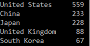
Exploration 1: The 5 most ranked countries
Let's first import pandas and then read in the csv file
          import pandas as pd

          forbes = pd.read_csv("forbes2000_2018.csv")
Use .head() to get the top 5 rows, then display the result using print(). Easy.
print(forbes["country"].value_counts().head())
For example, if we want the top 7 rows instead, we can do .head(7).
Here's the answer to our first question!
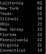
Exploration 2: The 5 most frequent headquarted states in the US
First, we save all the rows that have "United States" as a value in the column "country" into a variable called
"usa".
usa = forbes.loc[forbes["country"] == "United States"]
print(usa["state"].value_counts().head(10))
Exploration 3: Visualize industry percentage in a pie chart
Let's first see how many unique industries there are in the dataset.
print(forbes["industry"].unique().count)

Can you imagine how chaotic our pie chart will look like
when there are 83 slices of pie with so many labels in a circle?
But hell, let's do it anyway ... coz ... why not? There's nothing to be ashamed of here :D.
We will use matplotlib library to create the chart. Let's import it now.
import matplotlib.pyplot as plt
          labels = forbes["industry"].value_counts().index.tolist()   # ordered from most to least frequent

          sizes = forbes["industry"].value_counts().tolist()          # sizes in % unit
          explode = [0.1]      # explode only the biggest slice, 0.1 to explode, 0 for the non-explodes

          for i in range (len(labels)-1):

              explode.append(0)
          fig1, ax1 = plt.subplots()

          ax1.pie(sizes, explode=explode, labels=labels, autopct='%1.1f%%', startangle=90)

          ax1.axis('equal')     # ensures that pie is drawn as a circle


          plt.show()
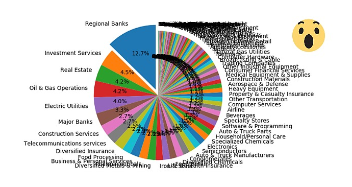
Not too bad after all.
We also get to visualize the industries that top the list and roughly get a sense of the distribution of industry percentages. How nice!
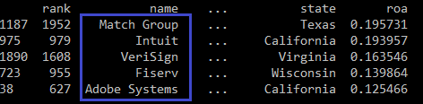
Exploration 4:
The top 5 US Software & Programming companies with the highest ROA
This one is also easy. Let's first define ROA.
ROA, stands for "return on assets", simply put, is a ratio that tells how well a company can generate profits
with the amount of assets it has.

To begin with, we save all the rows that represent US companies that are in the "Software & Programming"
industry into "usa_software".
usa_software = forbes.loc[ ((forbes["country"] == "United States") & (forbes["industry"] == "Software & Programming")) ]
usa_software["roa"] = forbes["profits"] / forbes["assets"]
print(usa_software.sort_values(by=["roa"], ascending=False).head())
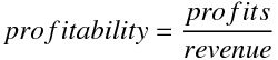
5. The 5 most profitable companies in the world
ROA is about generating profits out of available assets.
Profitability, on the other hand, is about how efficient a company makes its money.
Having known that profits is revenue that remains after expenses...
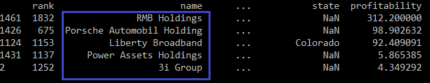
Like in the previous exploration. We simply calculate the profitabilities, sort in descending order and take the
top 5 rows.
          forbes["profitability"] = forbes["profits"] / forbes["revenue"]

          print(forbes.sort_values(by=["profitability"], ascending=False).head())
The End.
I hope you enjoyed the reading. <3